

UI/UX | Web & Mobile
Designing Electrum’s
EV Charging Software
2 months, 2022
Timeline
SaaS, web & mobile
Platform
Lead UI design, UX design
My Role
Overview
The project involved overhauling and rebuilding from the ground up an EV charging SaaS product for Vancouver-based Electrum Charging Solutions. The goal was to meet the distinct needs of multiple customer archetypes, including monitoring EV charging stations in commercial or residential buildings, reviewing charging statistics, and paying for charging sessions.
My Role
I led UX and UI design end-to-end, collaborating closely with a small cross-functional team of project managers, designers, and developers. I spearheaded the adoption of the Object-Oriented User Experience (OOUX) framework, developed the design system, and delivered the final design assets.
Problems
The previous system faced several challenges. We prioritized three of the most critical for the initial project phase.
1. Lack of scalability: The original product was built quickly to meet the needs of early adopters. As EV technologies and market trends evolved, adding new key features proved nearly impossible within the existing architecture. With the company’s customer base continuing to grow, the system could no longer support its expansion.
2. Inefficient internal workflows: Electrum’s admins relied on tedious manual processes to maintain the system and onboard customers, resulting in poor productivity and subpar usability for internal teams.
3. Outdated and inconsistent UX/UI: Developed with little designer involvement, the interface lacked visual and functional consistency. It also failed to reflect the company’s brand identity.
Challenges
Addressing these problems required a complete rebuild of the product, as little of the old system was salvageable. I was determined to place proper emphasis on the UX process in the redesign. However, time and resources were severely limited, with growing dissatisfaction among some of the company’s largest clients adding pressure. This meant I had to stay adaptive, work efficiently, and embrace strategic compromises.
Process
Initial Research: Under tight time constraints, the team and I prioritized interviews with the internal customer support team and key clients to uncover user frustrations and identify service gaps in the existing solution. I also conducted desk research to quickly build essential domain knowledge.
Defining users: Guided by the research findings, we clearly defined our users and their needs. From building managers monitoring a fleet of EV chargers to end-consumers charging their vehicles, we grouped existing users and prospects into four main roles.

Need to remotely monitor and control charging stations and view reports on charging statistics for a single location.
Location managers

Organization managers
Need to view reports on EV charging statistics of all locations under the organization.

End-consumers
Need to use charging stations, pay for charging sessions, and view their own billing details and history.

Electrum admins
Need to remotely set up, monitor, and control charging stations across all locations and manage user permissions.
Information architecture: To kick-start the design process, I led the adoption of the Object-Oriented UX (OOUX) framework, enabling us to quickly and thoroughly address the system’s complexity. It also helped surface new questions about business goals and user needs.
Using the OOUX toolset, the team collaboratively defined the product’s core architecture by breaking down the complex system into objects, their relationships, and associated calls-to-action.

Object Discovery: With coloured sticky notes, I used blue to denote objects, yellow for core content, and red for metadata. Each column represented a core object in the system along with its attributes and relationships with other objects.
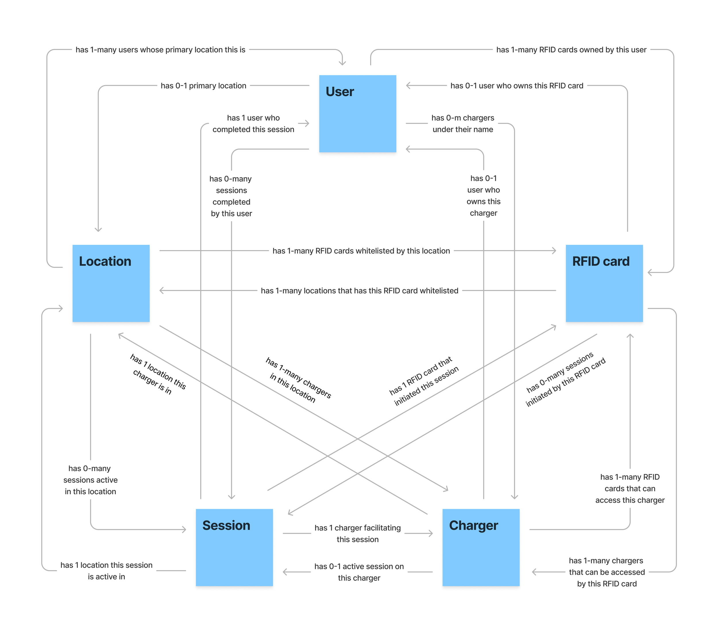
System Model: To visualize and explore the key relationships between objects, I created a system model. This model helped surface new questions about core product functionalities—such as whether users are tied to locations or if a single RFID card can initiate multiple simultaneous charging sessions.

CTA Discovery: With the CTA Discovery table, I brainstormed calls-to-action that can be performed on each core object in the system by different user roles. Paring down from a larger list, I prioritized the most essential CTAs for phase one of the project. This table would later also serve as an important point of reference and a pseudo-checklist for me during the UI design.


Wireframing: Before moving from ideation to prototyping, I conducted competitive and comparative analyses of existing market products. The team created a mood board to inspire our design direction. Together, we quickly produced sketches and wireframes to explore layouts and user flows. Toward the end of the process, we involved several Electrum admins to gather feedback.
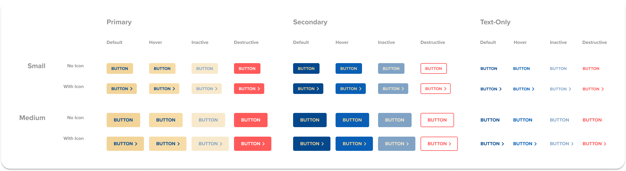

Design system: As Electrum’s first venture into digital products, they had no existing design system. Building one became a priority—not only to improve visual consistency but also to streamline the design process moving forward.
For this project, I designed a set of UI components and guidelines that formed the company’s initial design system iteration. I leveraged Electrum’s brand colours—blue and gold—as CTAs to provide visual emphasis against white and grey backgrounds. The overall style was clean and minimal, promoting intuitive user interactions.
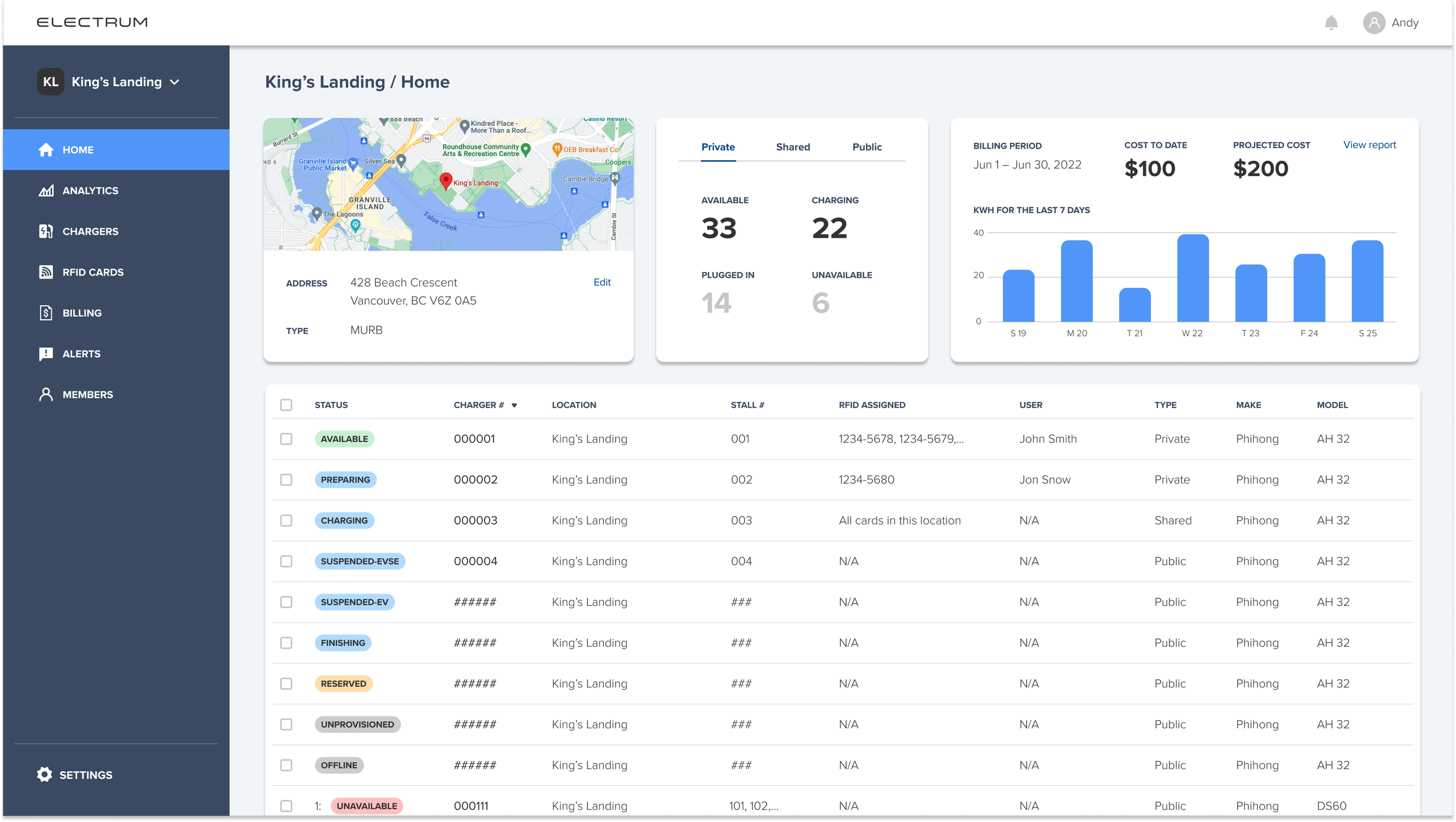
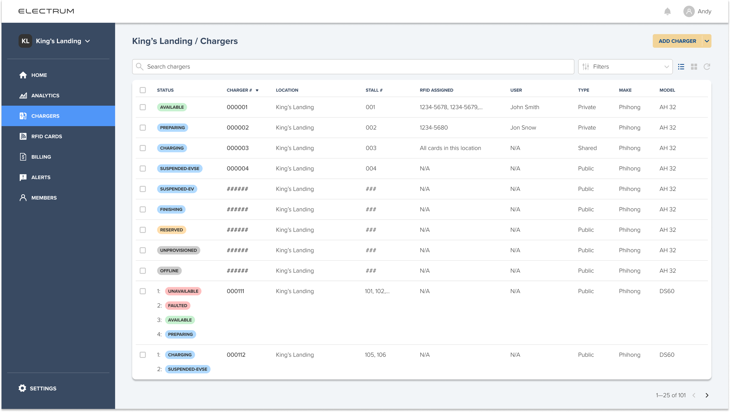


Prototyping: Collaborating closely with developers and other stakeholders, the design, testing, and development progressed in parallel. After several iterations, I created a high-fidelity, interactive prototype in Figma, which was tested with Electrum admins.

Launch: Through solid strategy and execution, the team successfully launched the MVP on schedule, delivering immediate business impact. Urgent customer requests were addressed, and pressure on Electrum’s admins was significantly reduced. Development on the product continues to evolve.
Reflections
Despite our best intentions, projects rarely have sufficient time and resources. One area that would have greatly benefited from additional investment was the user research and testing process. Although the team conducted interviews with key stakeholders and gained valuable insights to guide our design decisions, a broader mix of research methods—such as comprehensive usability studies, surveys, and A/B testing—would have been ideal. Given the constraints, I believe the team performed admirably.
A personal highlight of the project was the adoption of the OOUX methodology. While I had followed OOUX for some time, this was my first opportunity to successfully advocate for its practical application. The framework helped us break down the complex system into intuitive, explicit components aligned with users’ mental models. It also fostered a shared understanding across the team, providing a clear foundation that guided development from start to finish.